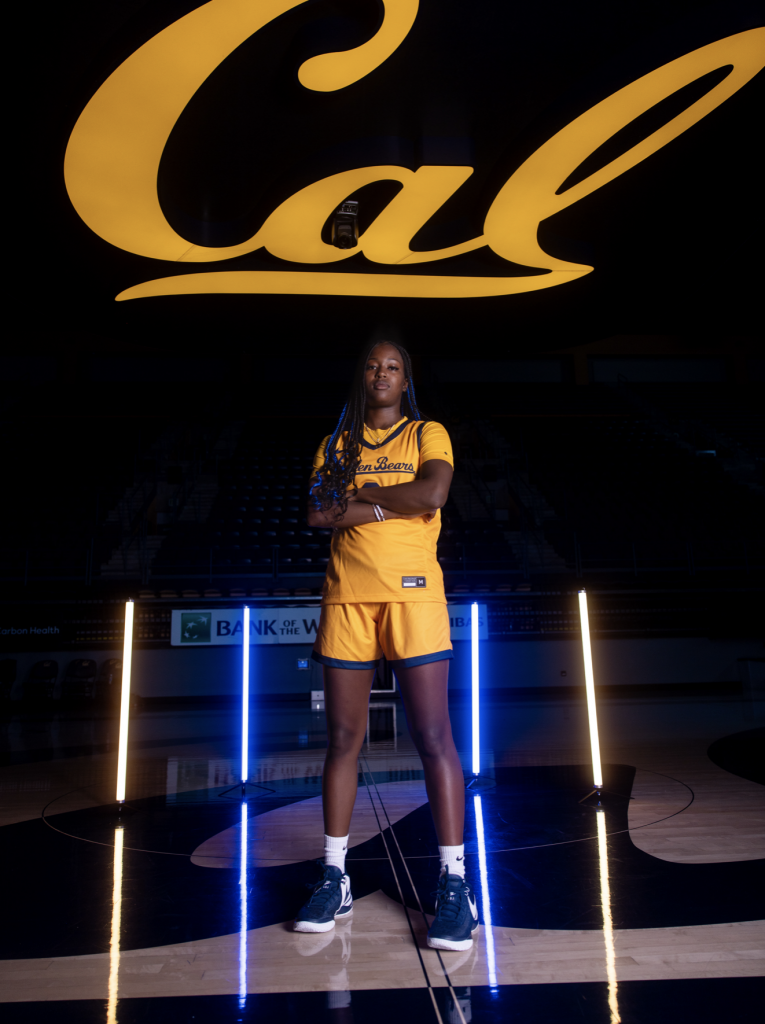
Cal – Art Direction Summary

Contribution  I led the creative strategy for brand identity, digital presence, and recruiting materials, aligning them with the core values of Bay Area culture and California pride. My approach infused the brand with a fresh, gritty aesthetic while maintaining cohesion with Cal’s broader identity.

Task

The challenge was to modernize and differentiate the brand, making it stand out in a crowded sports landscape. This involved pushing beyond traditional an outdated imagery and creating a bold look that resonated with both recruits and fans, while still honoring Cal's established prestige.

  • Strategy

    Brand Strategy

  • Design

    Art Direction, Design

  • Client

    Cal

Process & Results

This comprehensive art direction strategy resulted in a stronger, more recognizable brand for Cal Women’s Basketball. The revamped identity evolved from year 1 to year 2. It enhanced social media engagement, improved recruitment materials, and helped build a deeper emotional connection with both fans and prospective athletes. The structured graphics system established a lasting framework for the program’s visual storytelling, ensuring consistency and impact beyond a single season.

1. Aligned Brand Identity

Cool, Gritty, Bay Area Culture & California Love.

The number one goal was to balance the concept of “Bay Area loyalty”, with the desirability and coolness of “California”. The look also needed to shift away from the “traditional” stance the university academics typically emphasizes. I developed textures and elements that captured a “gritty” attitude that matched and represented the culture of the new head coach, Charmin Smith. 

2. Design Choices

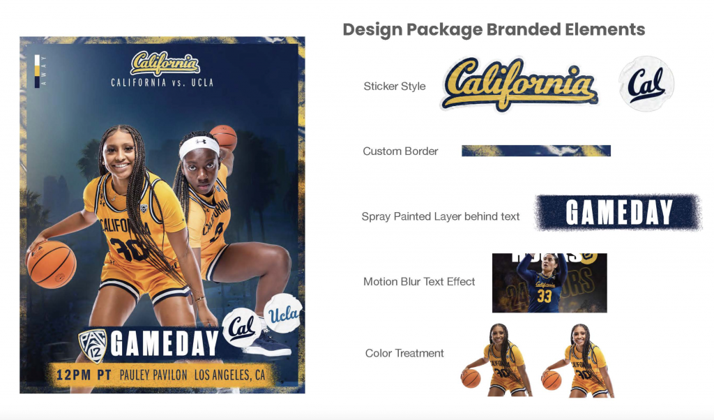
Key design choices:

Sticker Elements: Added dynamic, layered details to reinforce energy and personality.

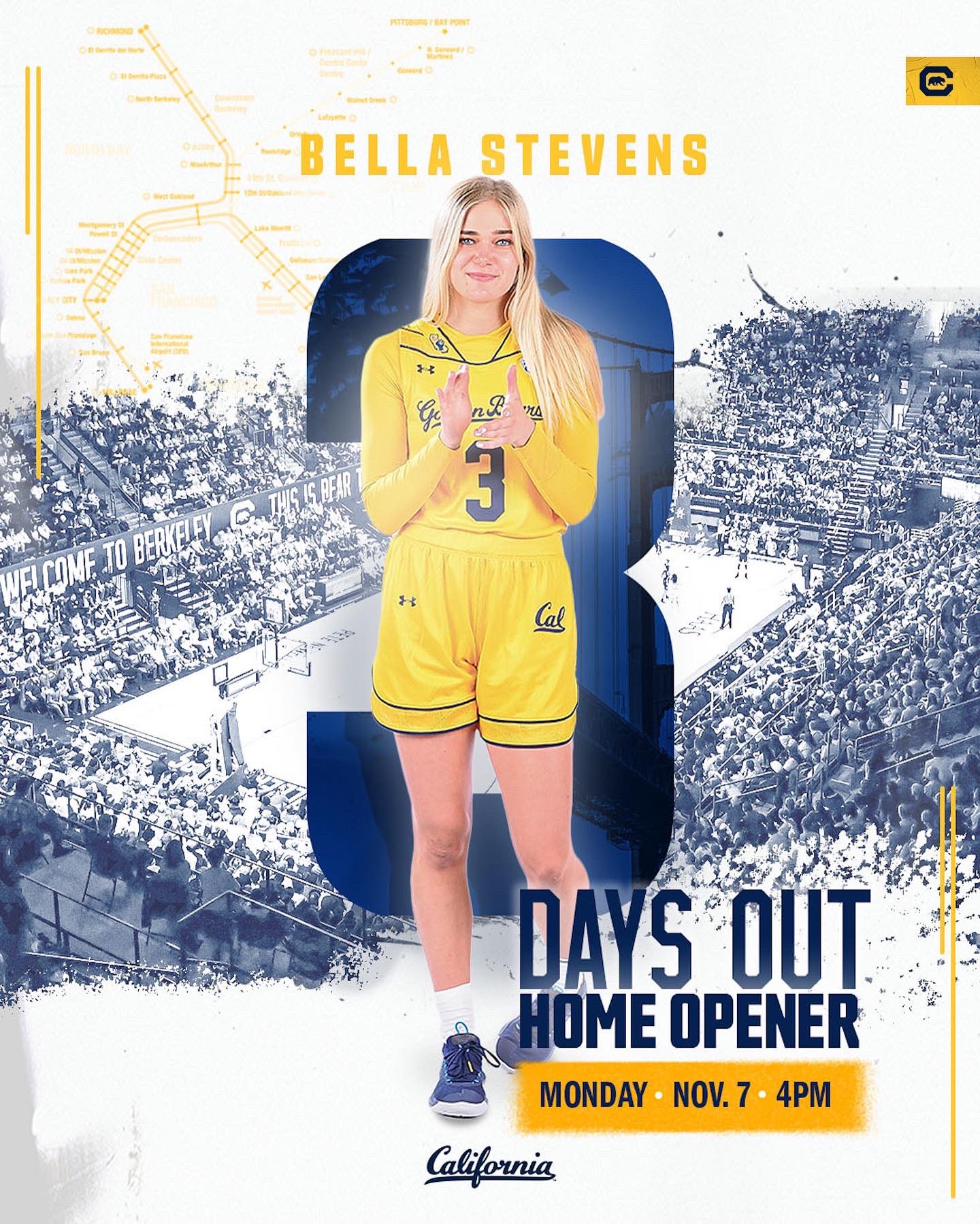
Spray-Paint Inspired Borders: Created a raw, street-style aesthetic that framed designs with a bold edge.

Spray-Painted Textures: Applied behind typography to add depth and grit, aligning with the team’s competitive style.

Motion Blur Effects: Introduced a sense of speed and surrealism, making player imagery feel more dynamic.

Consistent Color Treatment: Ensured uniformity across all designs, strengthening brand recognition.

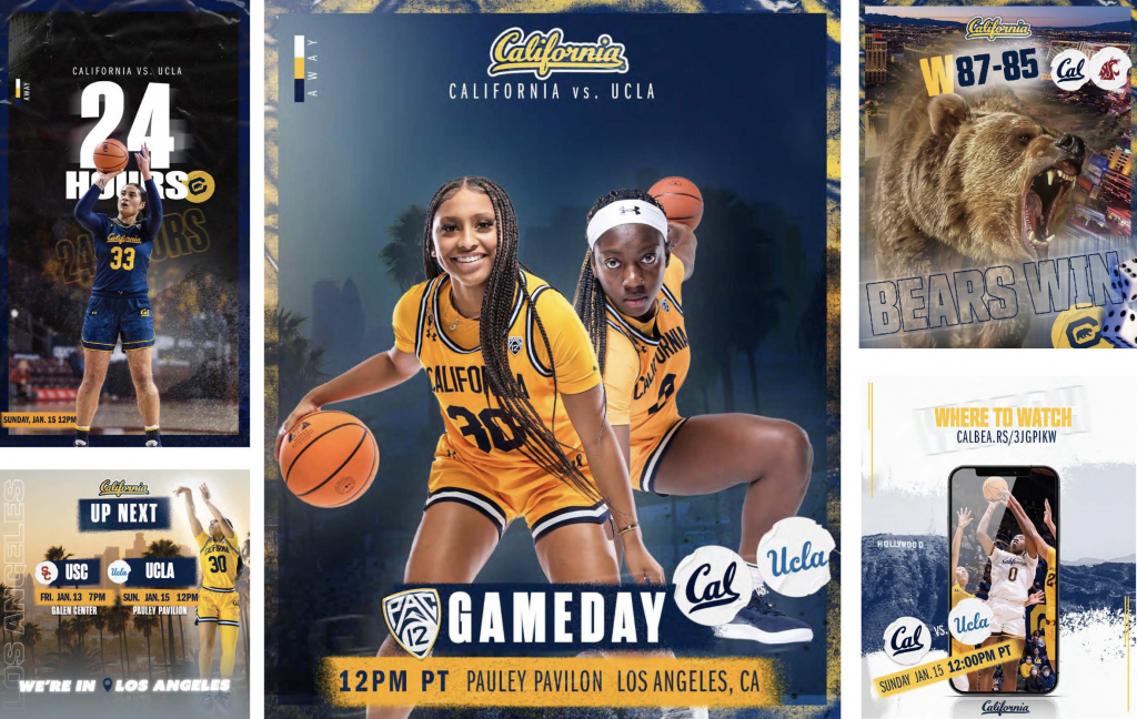
3. Graphic Package

I developed a certain visual identity  for all of our content, but especially in the following for promotions around games.

The goal was to use distinct design elements that would help women’s basketball stand out among other sports, yet still feel a part of the Cal brand. Realism in the various textures were cohesive across the several different graphic touch-points. 

4. Special Campaigns

Campaigns that required unique designs, but still achieved the look of our visual branding.

"The Streak"

Developed to follow star player, Jayda Curry’s 3 point record streak late in the season.

"Career Stats or Records"

Developed to celebrate player stat milestones

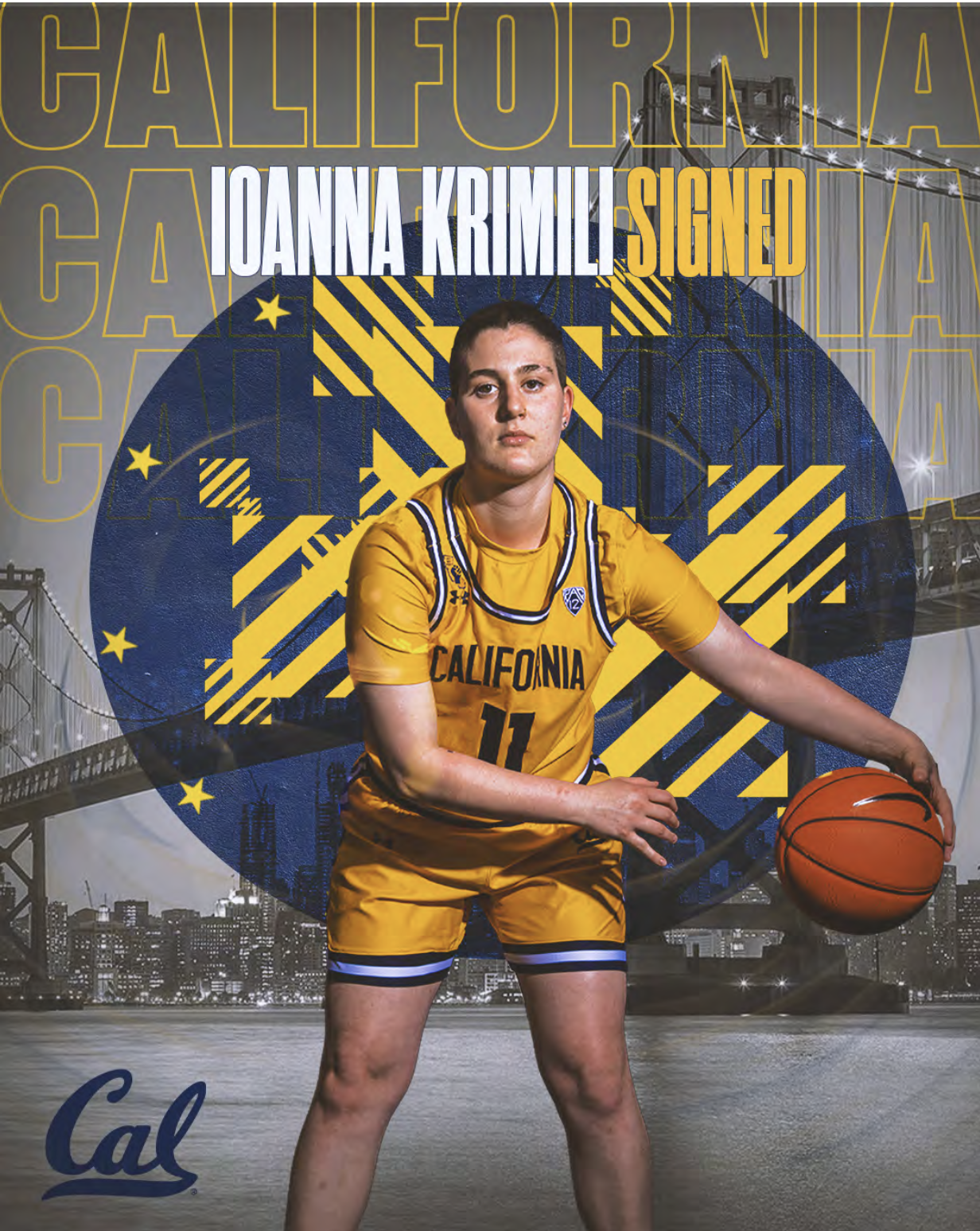
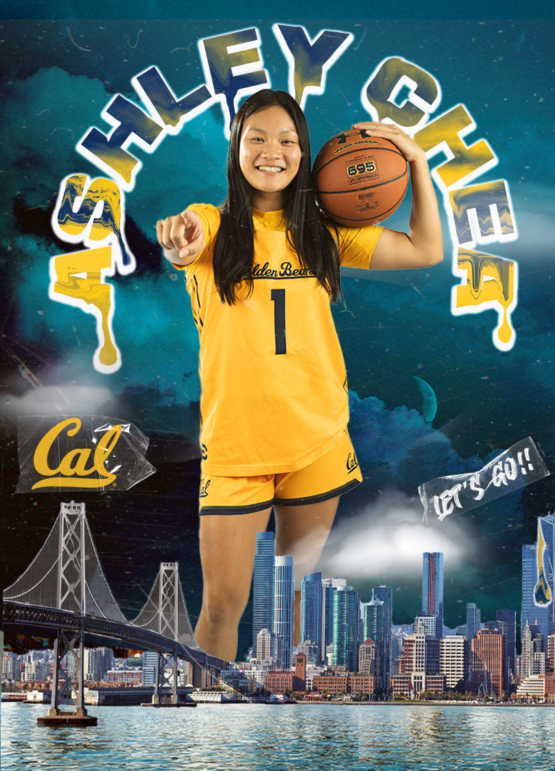
"National Signing Day"

A cohesive campaign featuring custom graphics to stand out, as we officially sign players to the team.


"Awards"

Developed to for end of season conference awards.

"Home Opener"

Graphic campaign supporting promotion/marketing for the the first game of the season

"Special Game Promos"

Graphic campaign supporting promotion/marketing for high profile games.

WNBA Alumni

Graphic campaign supporting Alumni in the WNBA.

4. Recruiting

Rebranded creative material for 12 month campaign.

Special Branded Messages

This is an example of specific brand messages I scripted for the recruiting campaign “Build it” Narrated by Cal Alumni and NFL player, Marshawn Lynch. The message and visuals depict other Cal Alumni’s that have “built” success and is a call to action for recruits to do the same for an up-and-coming program.

Aside from themes like “Build it”, “Keep it Golden”, and the Golden Ticket, I developed  several pieces of eye catching content for recruits, in their recruiting process with Cal coaches.

The Golden Ticket

The “Golden Ticket” is a project I spearheaded as a rebrand. The former campaign was outdated and mostly dominated by text. I created the graphic based series and logo in conjunction with the needs of the coaching staff.

This recruiting campaign serves as the foremost touchpoint for coaches to communicate with prospective players. It is sent through the mail, and represents 20 of the most important themes about the Cal experience.

Photoshoots

Strategized custom content based on recruits interests, and other creative themes. As well as in-person photoshoots for top recruits, with the goal of making them look cool, unique and differentiated from other competitors seeking to do the same.

Back